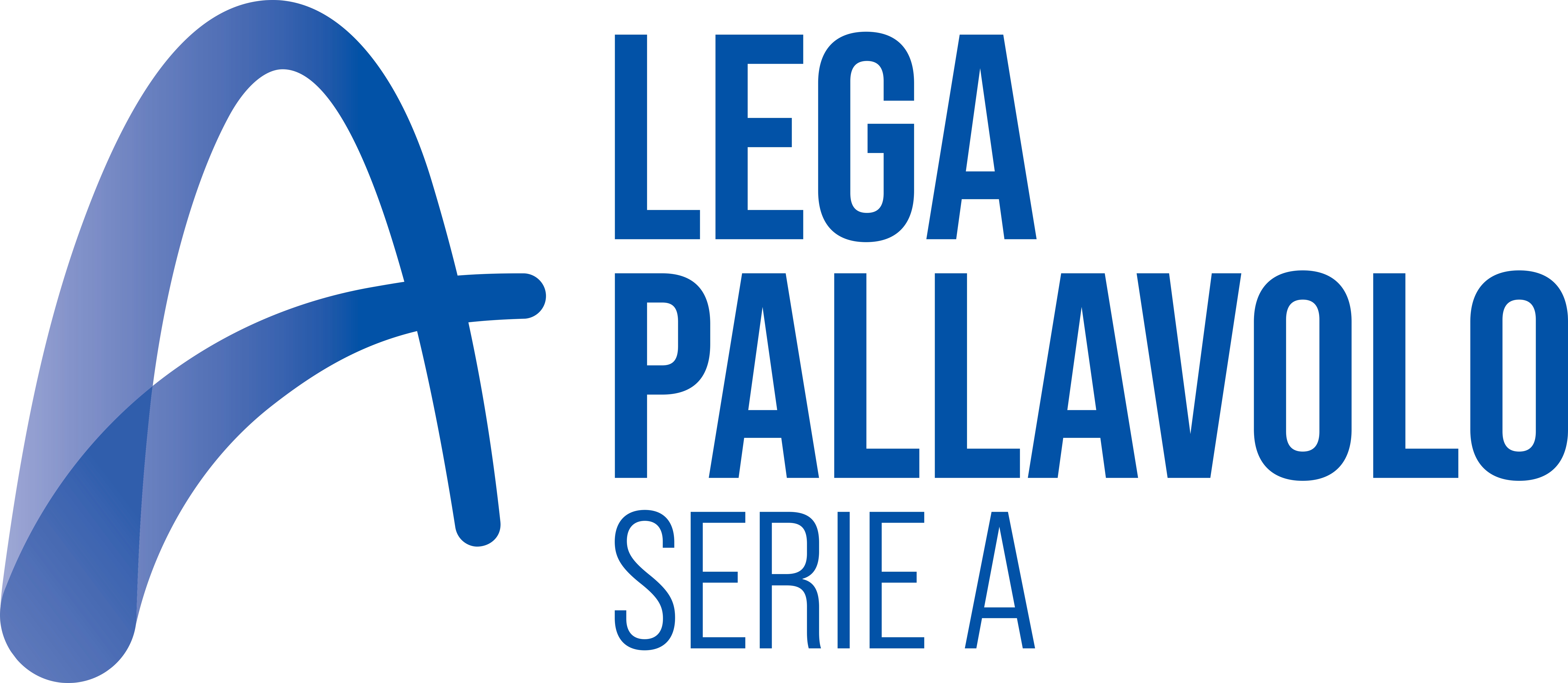
The new Lega Pallavolo Serie A logo was presented this morning. The first step in the strategic work was officially presented: the rebranding project, which involved both the restyling of the institutional logo, specifically the introduction of a new, distinctive pictogram, and the creation of a strong, powerful, and incisive narrative and communications platform aimed at best representing the club’s distinctive characteristics, uniqueness, and identity, as well as fostering a sense of belonging and strengthening its value in both the direct and indirect competitive arena.
Massimo Righi, President of the Lega Pallavolo Serie A: “This is one of the highlights of this event. We are pleased today to present the first step in a previously announced process: the rebranding of the Lega Pallavolo Serie A. We will create a very strong and impactful communications platform, which is exactly what we need. This is a project we’ve worked hard on, thanks in part to Jakala and GB22, two agencies that collaborated with us. I hope and expect this to be a moment of great shared reflection to fuel the growth of Italian volleyball.”
Stefano Corona (Sport, Business & Marketing Advisor): “Today we are ready to share the first concrete step of our work plan. This is an important moment, and I’d like to begin by thanking the Lega Pallavolo Serie A for its courage and the opportunity. Italian volleyball is experiencing excellent results, and this is the ideal opportunity to lay the foundation for further growth. I’m delighted to be able to accompany the Lega Pallavolo Serie A through this change alongside two important partners: Jakala and GB22, two communications agencies represented this morning by Andrea Biasi and Francesco Guerrera.”
The priorities highlighted are the rebranding of the Lega Pallavolo Serie A, which will be followed by a restyling of the digital and social media platforms and the development of a new communications platform. This rebranding is based on a strategic and important process and is proving to be a powerful tool.
Andrea Biasi (Jakala): “We designed the logo with a modern feel, featuring the verticality, trajectories, and movements typical of volleyball. A simple dynamic that represents the sport well. The blue palette was chosen both for its institutional appeal and for its vibrant, high-impact nature.”
Francesco Guerrera (GB22): “Our strategy began with the word Lega, which has two important meanings: the bond that unites people through volleyball, but also the union of two metals, which, when united, give each other strength. Volleyball, made up of athletes and professionals who bring us excitement every week, is also made up of fans.
“I immediately liked the slogan,” continues President Massimo Righi. “It represents Italian volleyball. It represents its values, quality, and development. We analyzed many proposals before choosing the logo we’ve revealed to you, and this choice was based on a study of other sports logos around the world, to understand if our direction was consistent.”
Yvonne Schlesinger (Deputy Director of the Lega Pallavolo Serie A): “This choice perfectly represents us, as we continue to look to the future because we are a movement constantly ‘on the move.’ We are excited and satisfied because this is a new beginning without forgetting our origins.”